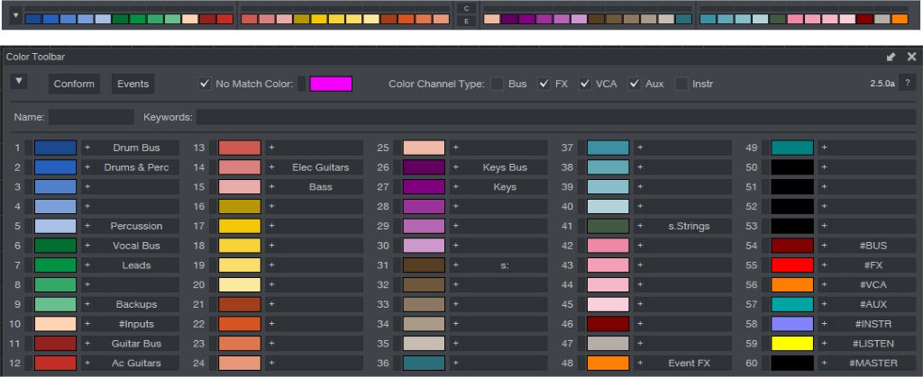
Color Toolbar v2 for PreSonus Studio One
The GUI interface that PreSonus has for the Studio One product has a love-hate relationship with the user base or potential user base. Some prefer its simplicity to the skeuomorphism of other products and others feel like it has a cartoon-like look to it that feels unprofessional and uninspiring. Me, I like it - I thin k it is a bit minimal and functional while at the same time providing almost enough customization options to appease the part of me that wants visuals to go with the audio I'm producing. The FREE Color Toolbar addon for Studio One doesn't really add any new visuals to the overall look of the GUI, but it definitely helps to make your tracks and channels look like you want them to quickly and easily. Read on for more information and a video walkthrough of the plugin.
When I originally switched from Cakewalk/Sonar (now by Bandlab) to PreSonus Studio One, I initially thought I'd miss the graphic representations of "real knobs and sliders" and the various other graphics, like track icons, but after using Studio One for a while, I found that those things were not as important to me as I originally thought. In fact, I looked back at them as almost a distraction. They had an allure that was founded in the idea that users want to see things in full hardware form in the digital world - and maybe many still do - but I found that the end result was that I was continually looking for the perfect view rather than continuing on my persuit of the perfect recording, track, performance, or mix. Studio One helped me to focus more on those elements.
But the downside to that was the lack of GUI elements that got me close enough to that goal without being frustrating. Enter the Color Toolbar. Laurence, a PreSonus forum veteran, it seems, had created this great plugin for allowing access to a much faster workflow for getting to colors for tracks and channels than the somewhat random view that PreSonus themselves provided. I'm still perplexed as to how the color selection box was generated in Studio One.
Now, Laurence has passed the torch to a different team of support folks and developers to build on the vision he originally had. The new v2 of the Colorbar has been produced and expanded on with all kinds of cool new features, allowing for even more control over how colors can be assigned to the areas of a Studio One project. Whether its for the tracks, channels, busses, FX, Auxes, or other areas, even including the Arrangement section, the new Color Bar v2.x makes conforming your colors to a scheme better than ever.
The video below goes into the details on the installation and use of the new v2 of the Color Toolbar for Studio One, available here: . Hope you enjoy!
Comments
By accepting you will be accessing a service provided by a third-party external to https://www.blades.technology/

